Organisme gouvernemental
Signalétique
Signalétique
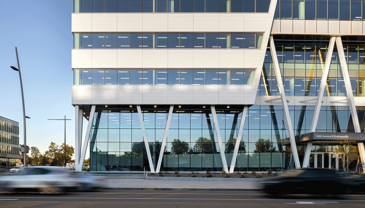
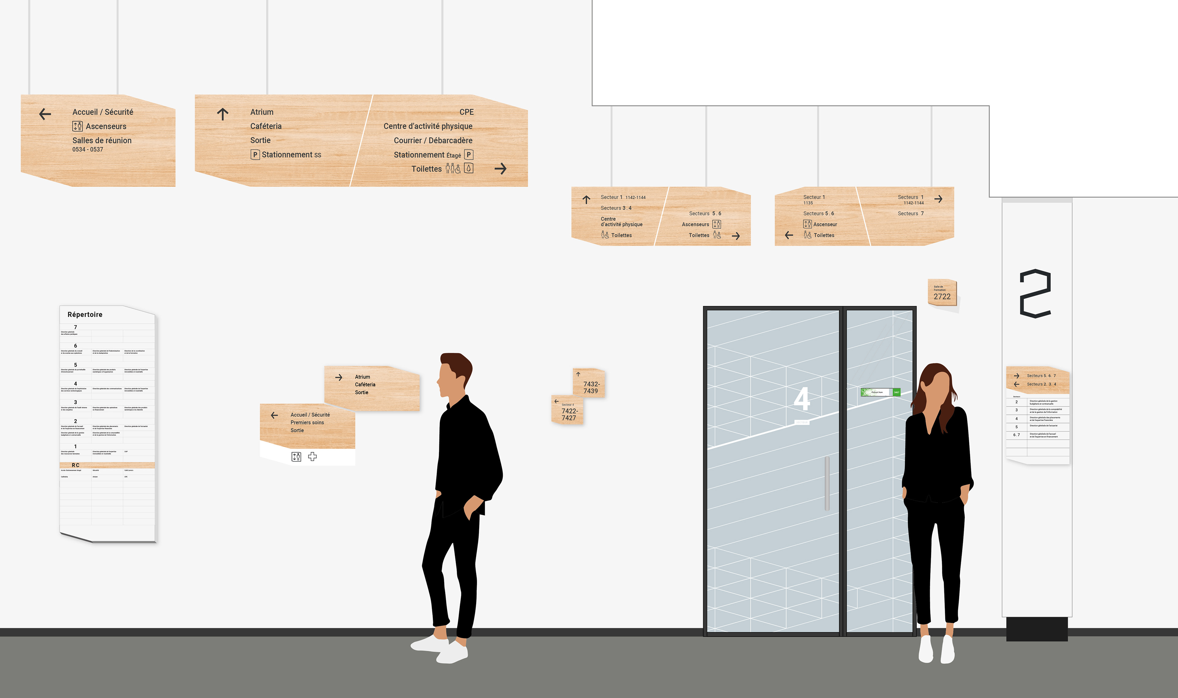
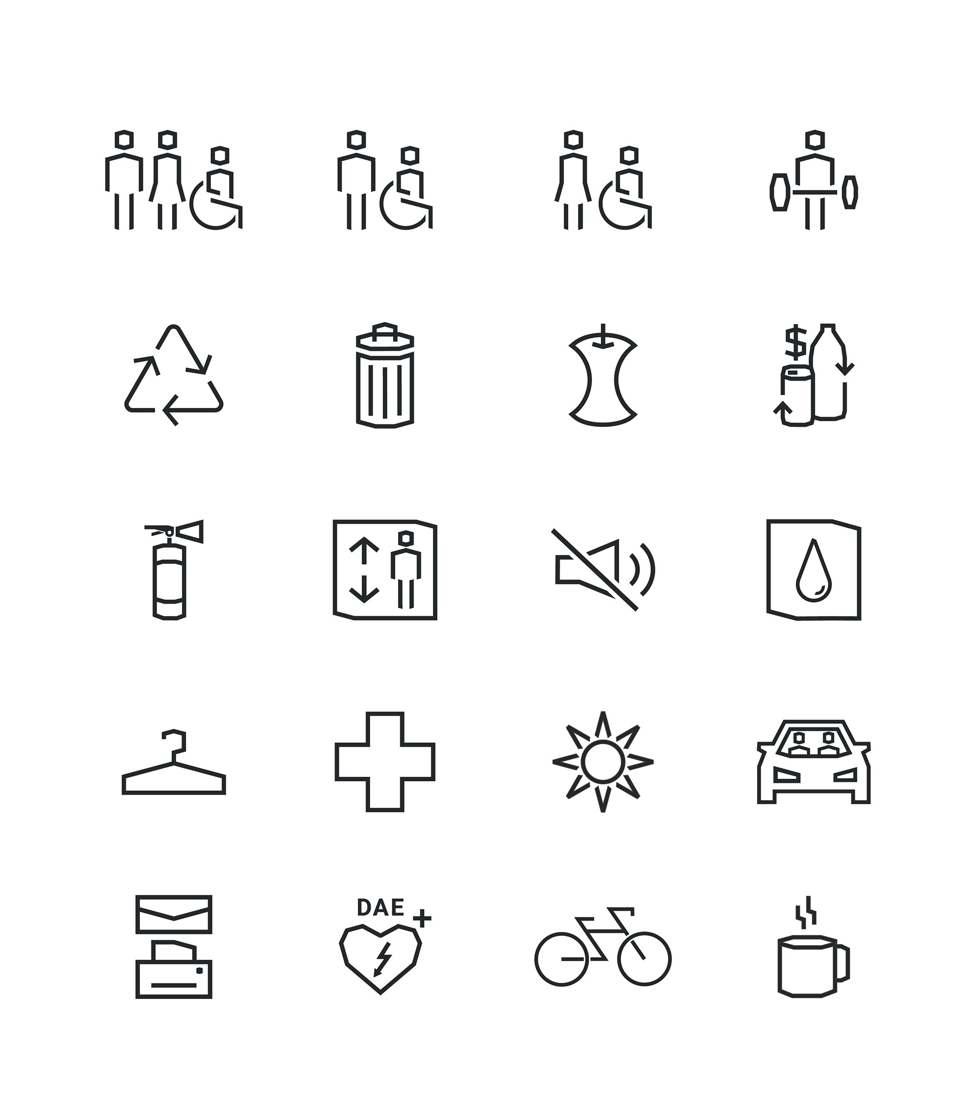
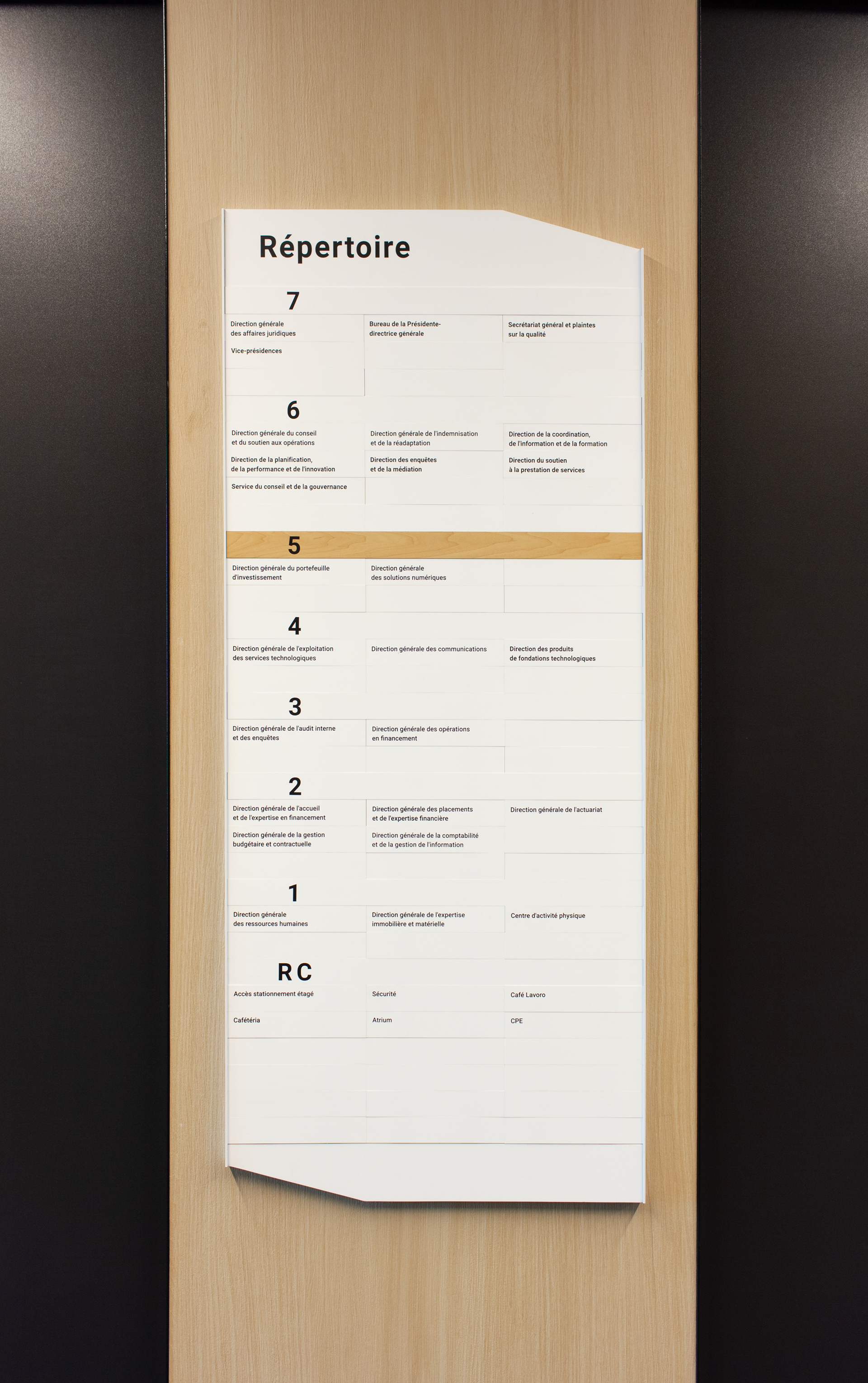
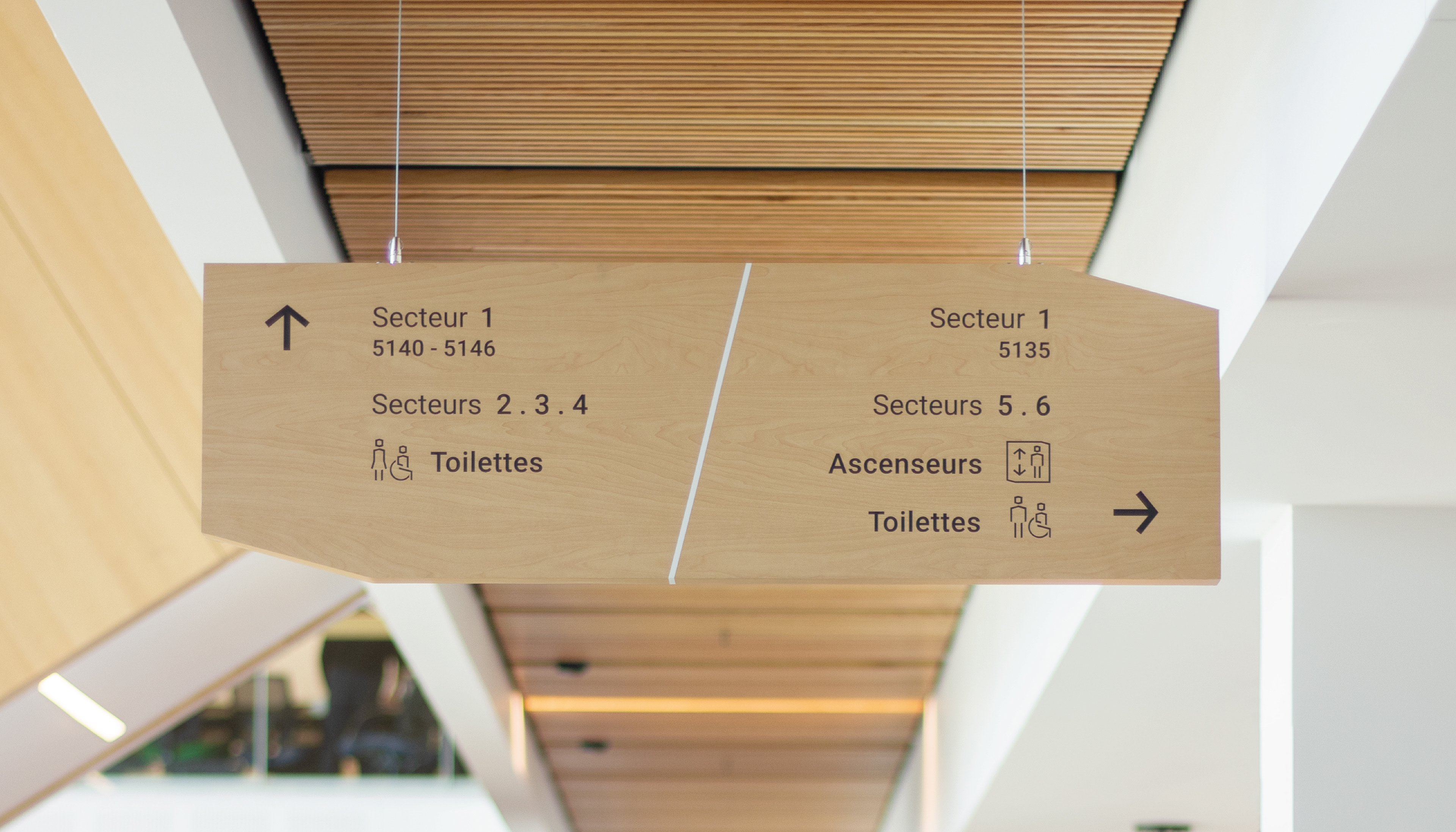
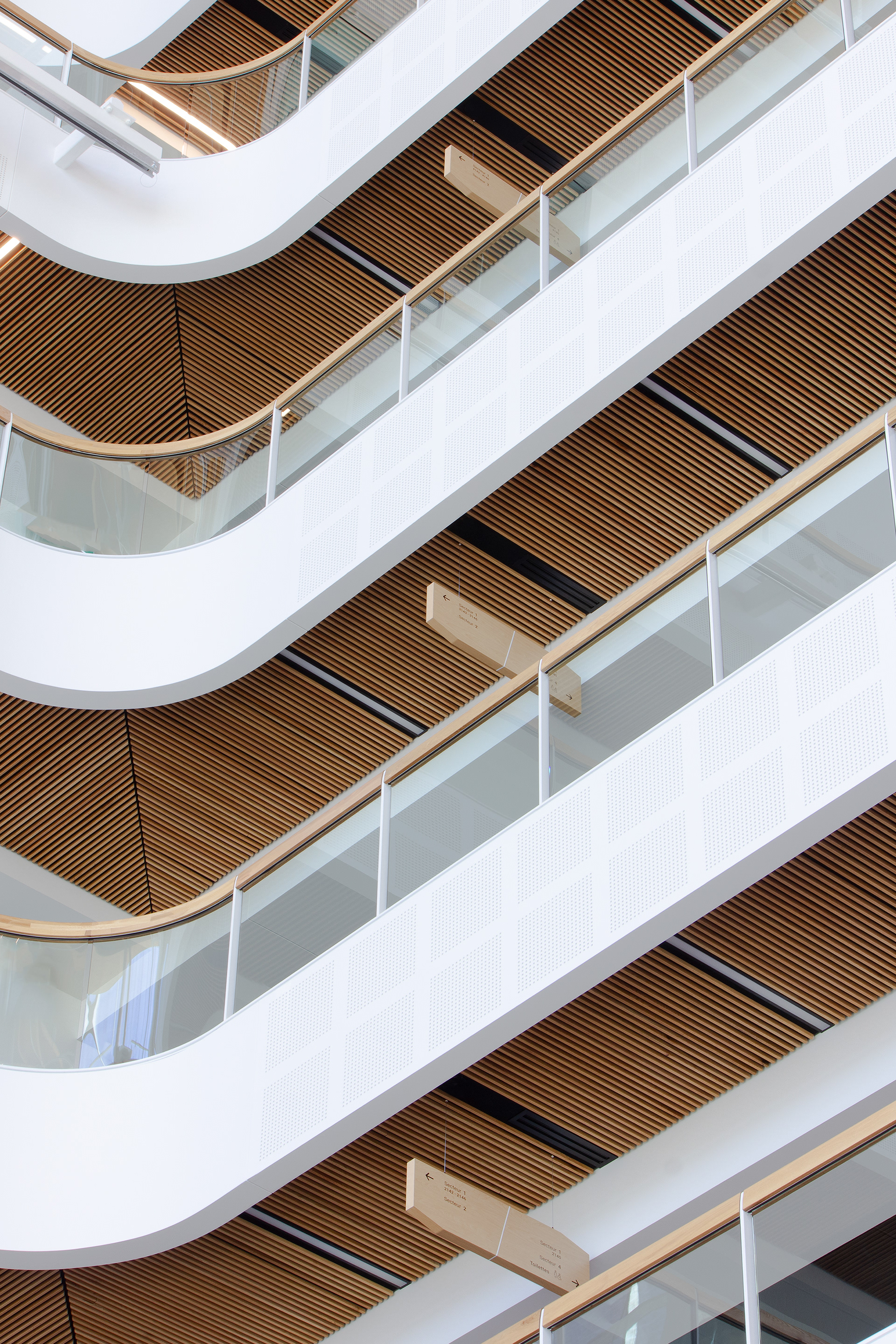
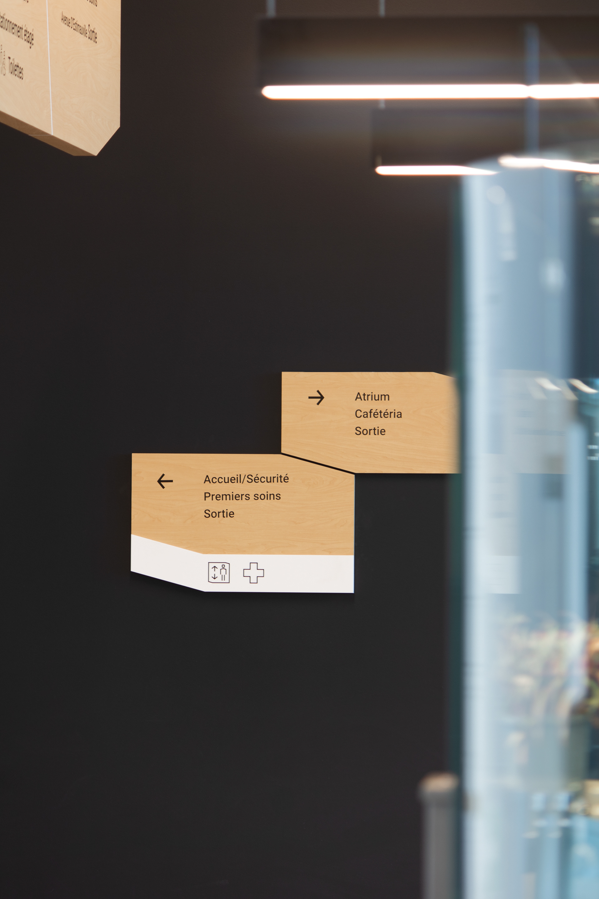
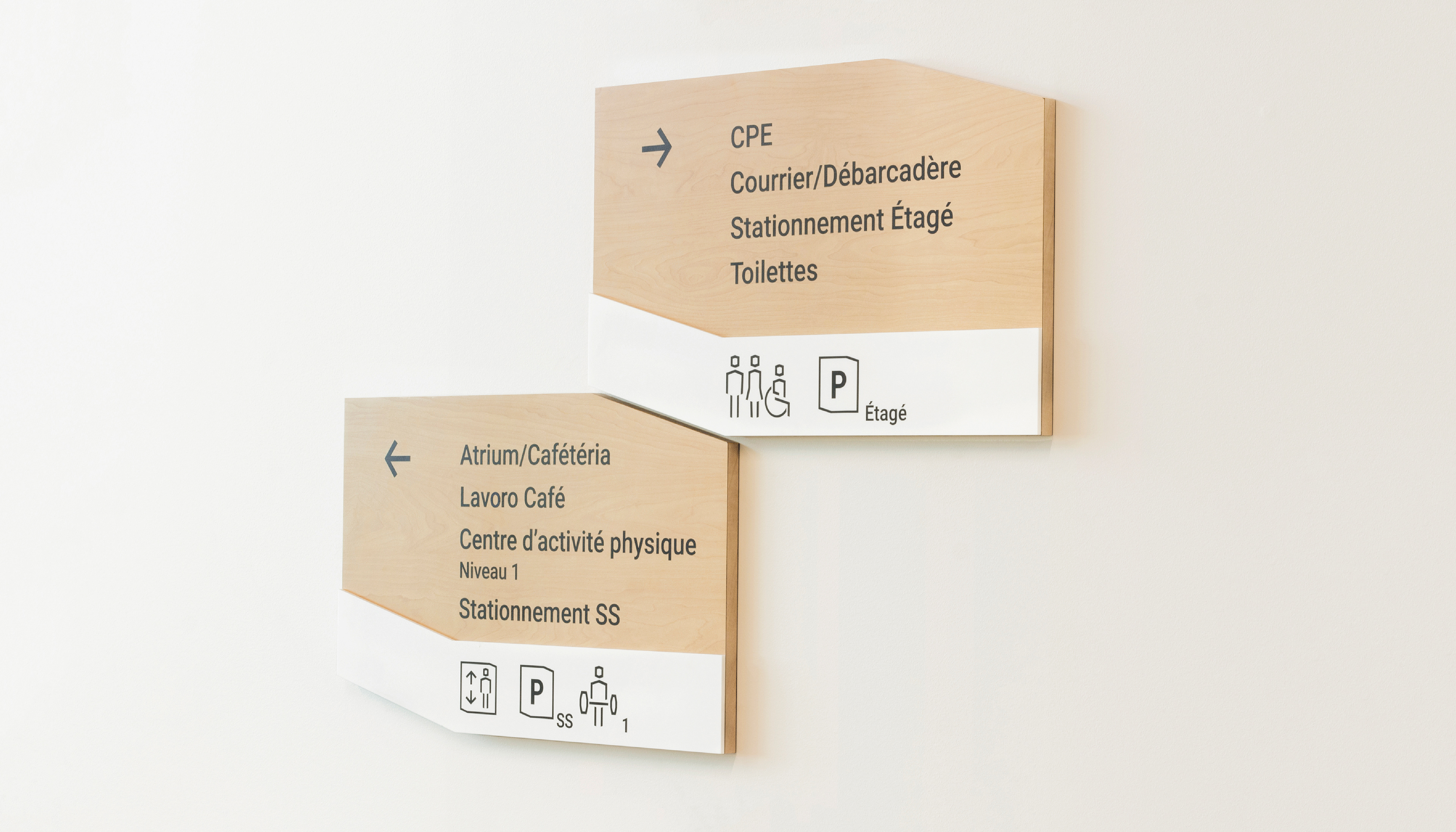
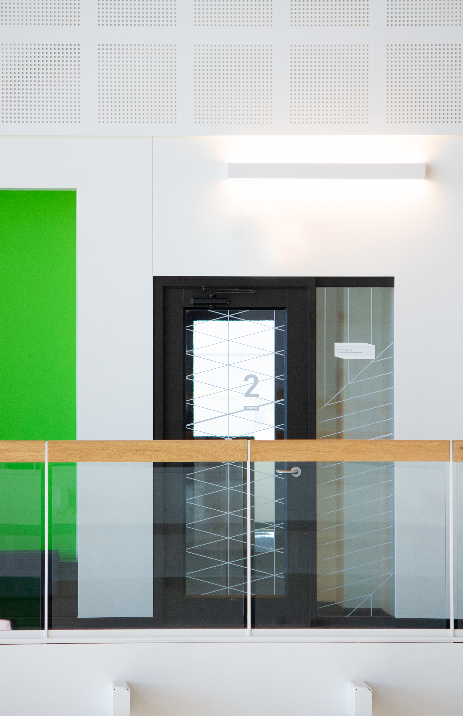
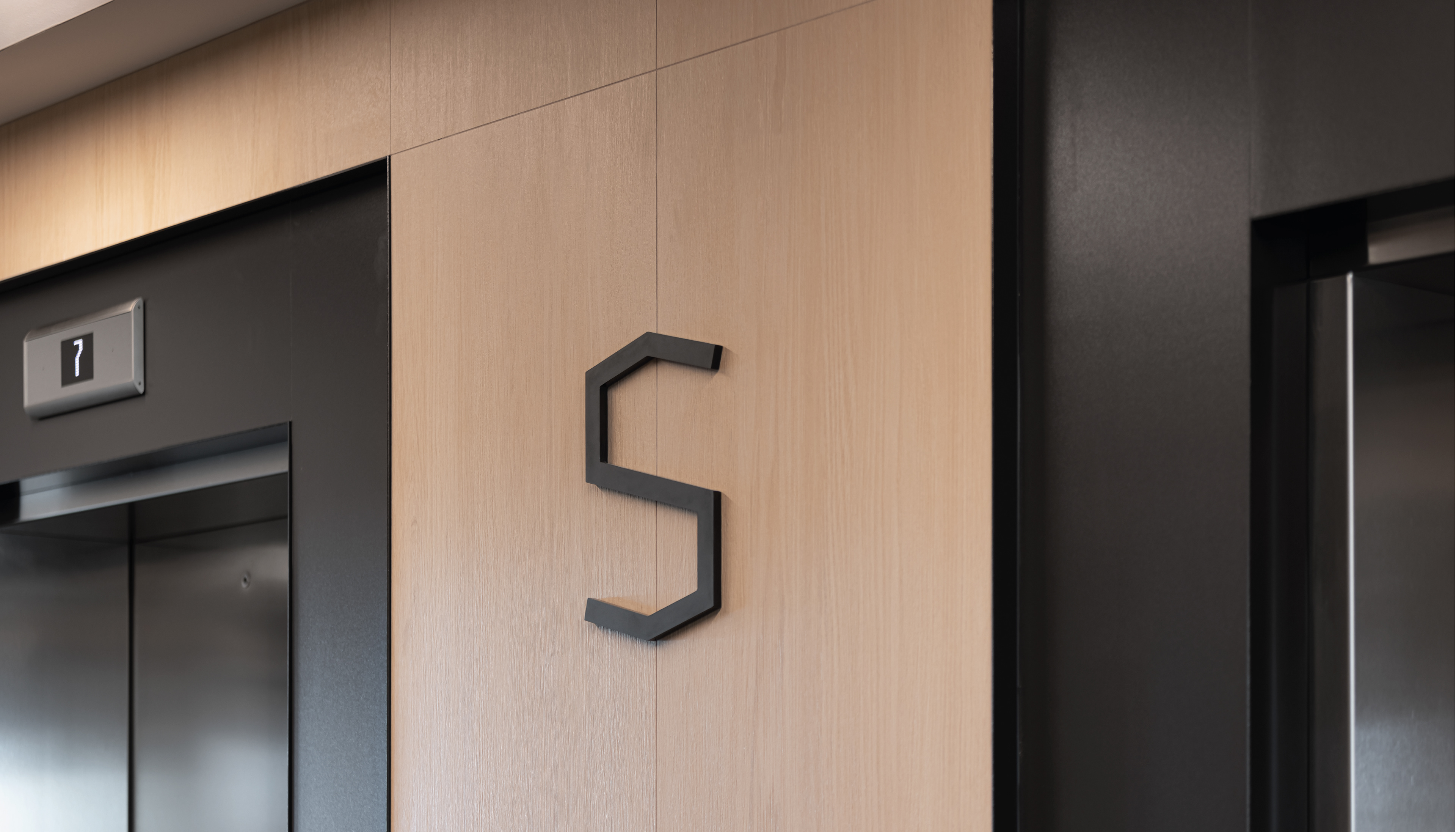
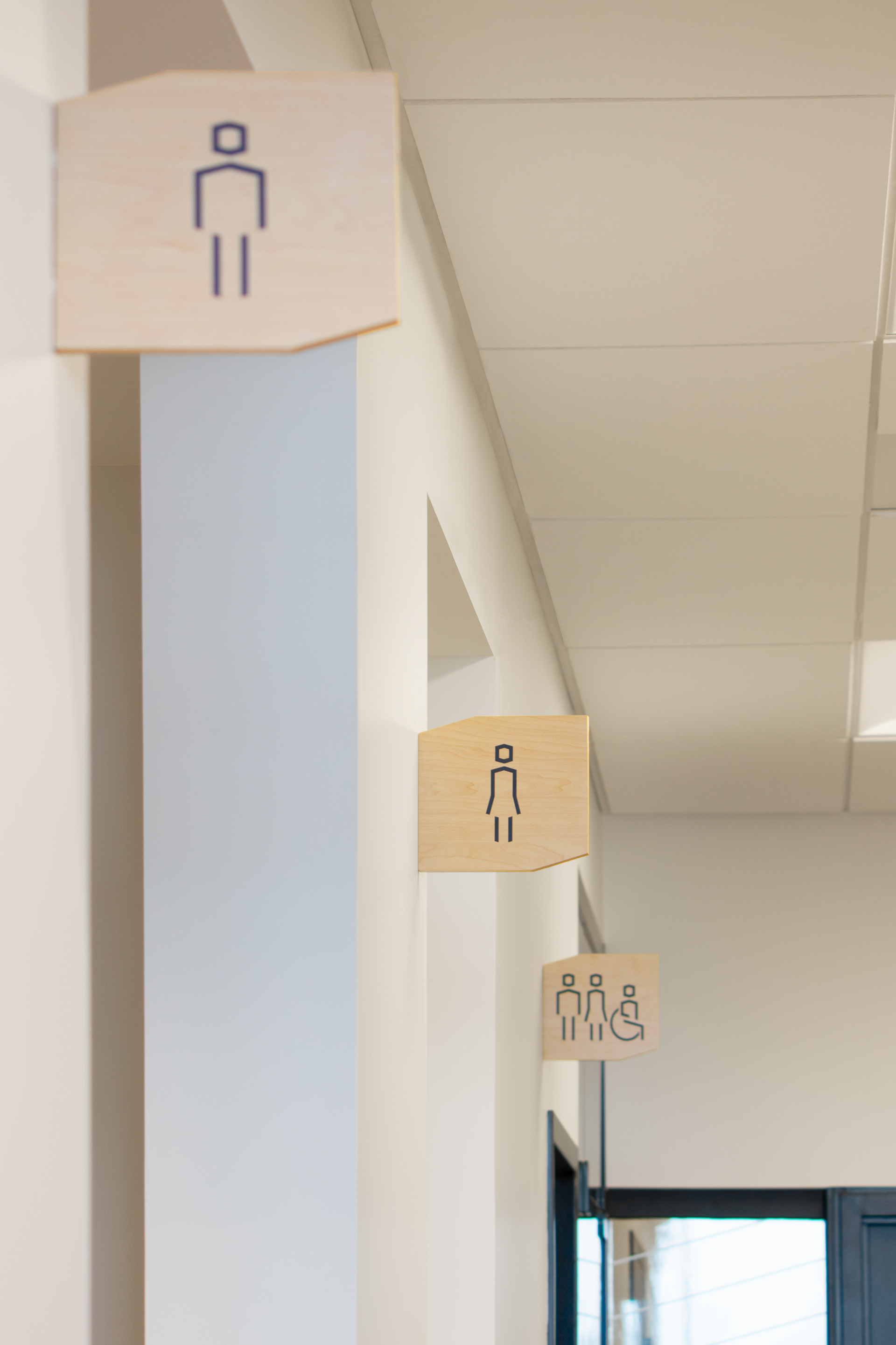
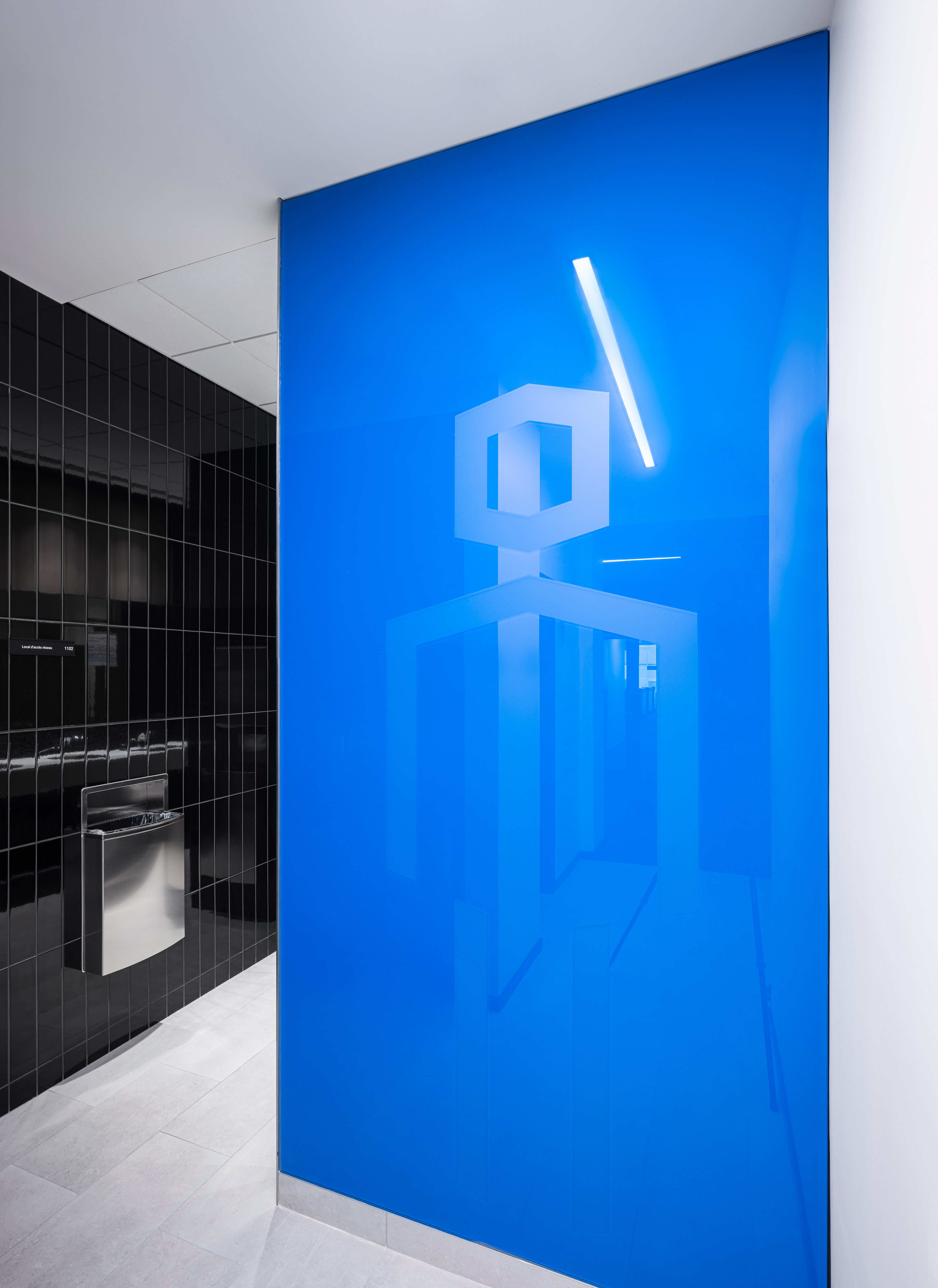
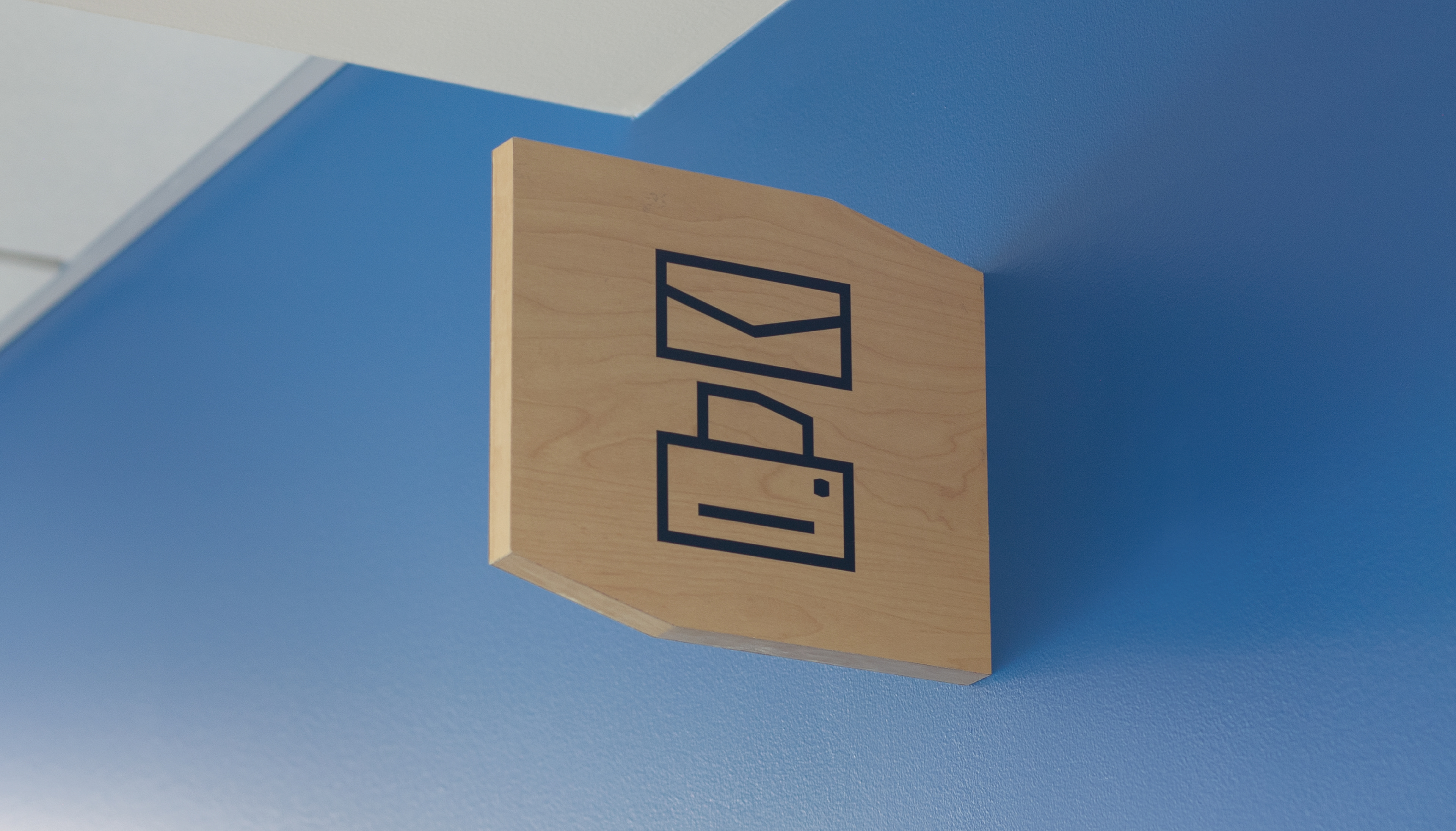
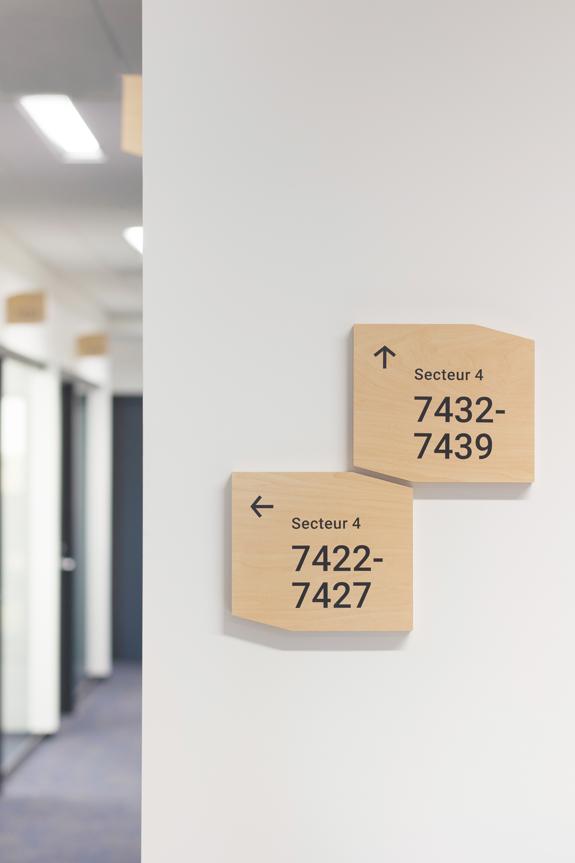
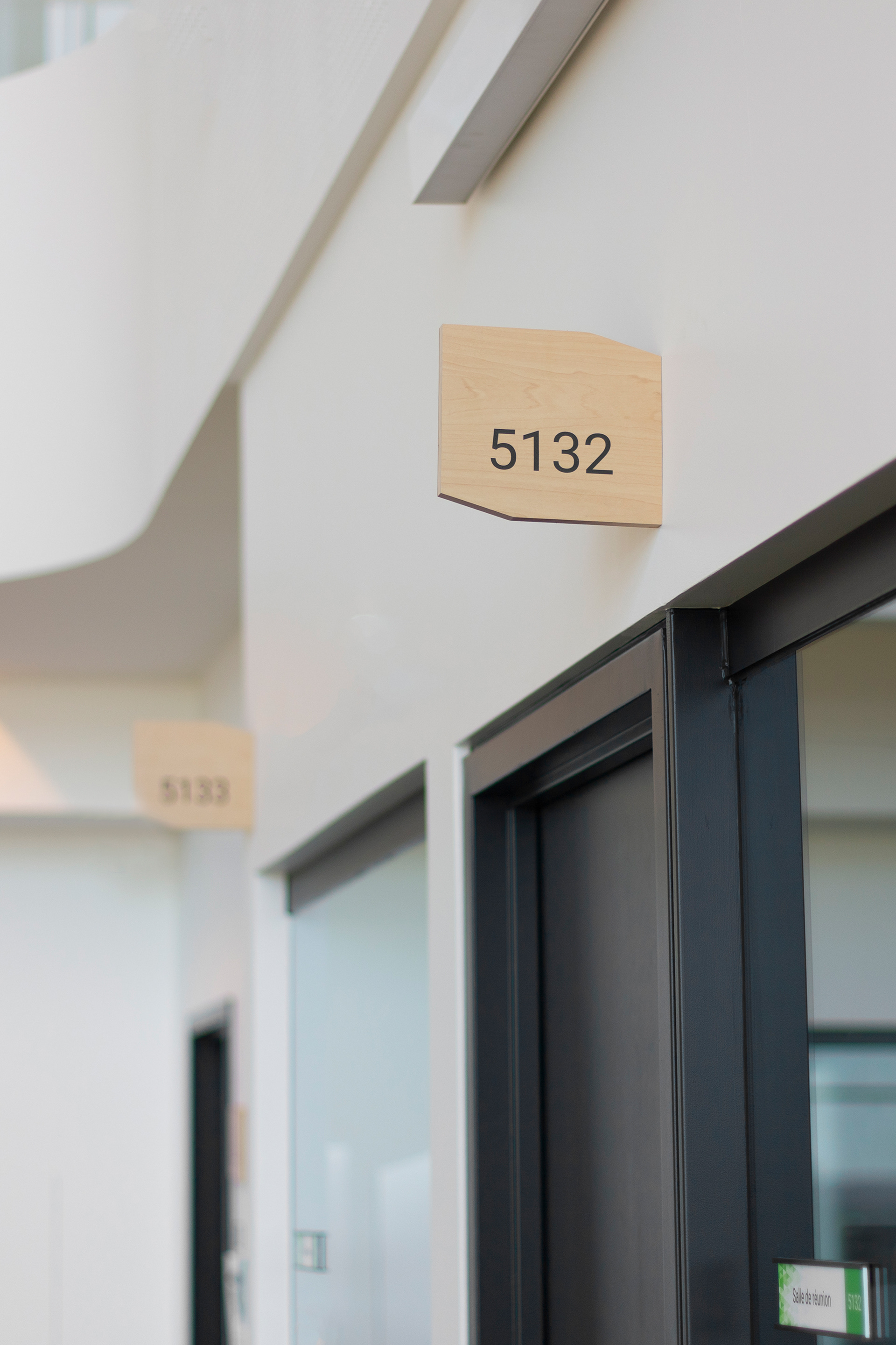
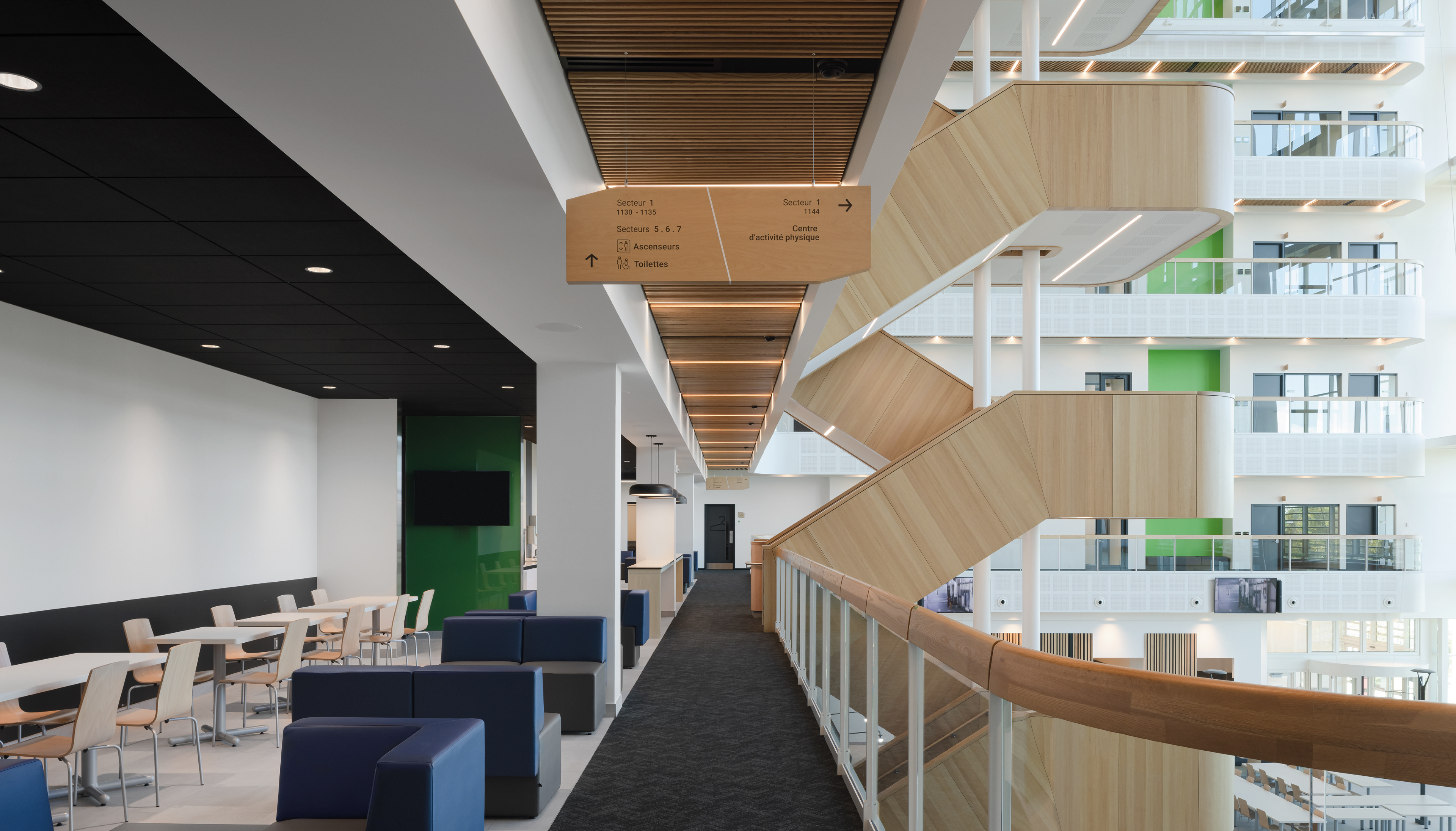
Ce mandat réalisé pour le nouveau siège social d'un organisme gouvernemental, en fut un d’envergure en ce qui a trait à l’intégration signalétique. S’insérant dans un mandat d’aménagement d’intérieur, l’apport signalétique avait un enjeu clair : guider l’utilisateur à travers un espace totalisant 395 000 pieds carrés, comportant plus de 1850 postes de travail, le tout réparti sur huit étages. La conception de la famille et du système signalétique, ainsi que des pictogrammes, s’inspire d’une grille géométrique composée de losanges. Ce motif réfère à un geste architectural fortement présent dans l’environnement bâti du nouvel édifice. Le choix des matériaux a été fait en fonction de leur pleine intégration à l’environnement bâti. Les finis utilisés dans ce projet proposent une ambiance corporative chaleureuse et lumineuse, de style minimaliste. Ainsi, un stratifié bois a été retenu pour complémenter le chêne rouge naturel bien présent dans l’architecture intérieure. C’est le cas aussi pour le noir et le blanc, qui serviront soit pour distinguer certaines catégories de messages ou pour assurer un contraste adéquat pour les éléments typographiques.
Government agency
Signage
This mandate completed for a government agency's head office was a major one in terms of signage integration. As part of an interior design mandate, the signage component had a clear challenge: to guide the user through a space totalling 395,000 square feet, with more than 1,850 workstations, distributed over eight floors.The design of the family and the signage system, as well as the pictograms, was inspired by a geometric grid composed of losanges. This motif is a reference to a particular feature that is strongly present in the architecture of the new building. The choice of materials was based on their seamless integration into the built environment. The finishes used in this project offer a warm and luminous corporate atmosphere, in a minimalist style. For example, a wood laminate was chosen to complement the natural red oak, which is very present in the interior architecture. The same is true for the use of black and white, which will serve either to distinguish certain categories of messages or to ensure adequate contrast for the typographic elements.
CRÉDITS PHOTOS / PHOTO CREDITS
© photos : Stéphane Groleau
LEMAYMICHAUD Architecture Design